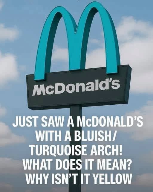
In the middle of Sedona, Arizona, surrounded by towering red rock formations and sweeping desert scenery, there is a McDonald’s that looks noticeably different from almost every other location in the world.
Instead of the familiar golden arches, its famous “M” is turquoise.
For visitors who have spent years associating McDonald’s with bright yellow arches, the unusual color can be surprising. Some people assume it is a special marketing campaign or a limited-edition design. But the story behind the turquoise arches is actually connected to Sedona’s efforts to protect its distinctive landscape.
A McDonald’s Unlike Any Other
Sedona is famous for its dramatic red sandstone formations, desert vegetation, and scenic views. The community has long placed importance on making sure buildings and commercial developments fit into the surrounding environment.
That philosophy extends to signs and other highly visible features.
When McDonald’s prepared to open a restaurant in Sedona in the early 1990s, the company faced an unusual design challenge. The traditional golden arches were instantly recognizable, but their bright yellow color could appear particularly bold against Sedona’s natural landscape.
Rather than allowing the standard design to dominate the scenery, local officials wanted the restaurant to follow the community’s visual standards.
The solution was surprisingly simple.
The arches would remain, but they would no longer be gold.
They would be turquoise.
Why Turquoise?
Turquoise might seem like an equally noticeable color, but in Sedona it offered a different visual effect.
Against the area’s red rocks, blue skies, and muted desert tones, turquoise was considered less visually aggressive than the traditional bright yellow. It allowed the restaurant to retain the unmistakable McDonald’s symbol without making the building’s signage compete as strongly with the surrounding scenery.
The compromise worked.
McDonald’s maintained one of its most recognizable brand elements, while Sedona preserved the visual character it considered important.
The decision also demonstrates an interesting tension between commercial identity and local character. A global company generally wants its restaurants to look familiar wherever customers encounter them. A distinctive community, however, may want businesses to adapt to local architectural and environmental expectations.
In Sedona, neither side had to completely give up what mattered.
From Compromise to Attraction
What began as a practical design decision eventually became part of the restaurant’s identity.
Visitors noticed the unusual arches.
People traveling through Sedona for hiking, sightseeing, photography, and outdoor recreation began stopping to take pictures. The restaurant became more than a place to grab a quick meal—it became one of those unexpected roadside curiosities that travelers remember.
The turquoise arches are particularly striking because they immediately challenge expectations.
You see the familiar shape of the McDonald’s logo, but the color tells you that you’re somewhere different.
That’s part of what makes the location memorable.
Sedona itself is known for resisting visual sameness. Its landscape is so distinctive that even ordinary commercial buildings can look out of place if they ignore their surroundings. The turquoise arches became an example of how a familiar piece of corporate design could be modified without completely disappearing.
A Lesson in Local Identity
The story also highlights something larger than a fast-food restaurant.
Across the United States, communities frequently establish zoning and design standards intended to preserve historic districts, scenic corridors, architectural character, or important natural views. Businesses operating in those communities sometimes have to modify their usual designs to fit local requirements.
Usually, these changes are subtle.
A sign may be smaller.
A building may use different materials.
Exterior lighting may be restricted.
Colors may be adjusted.
In Sedona, the change happened to involve one of the most recognizable commercial symbols in the world.
Instead of golden arches glowing against the desert, visitors encounter turquoise ones.
The result is a reminder that local identity can influence even the biggest brands.
More Than a Color Change
It would be easy to dismiss the turquoise arches as a quirky design detail.
But their popularity suggests that the change means more than that.
The restaurant demonstrates how a community can ask a major corporation to adapt without demanding that the business abandon its identity. McDonald’s still looks unmistakably like McDonald’s. The arches are still there. The restaurant still serves the same basic concept familiar to customers around the world.
Only one highly visible detail was changed.
Yet that small alteration created something unique.
Instead of becoming another identical restaurant in another American town, the Sedona location became connected to the place around it.
For travelers, the turquoise arches now serve almost like a visual greeting: you’re not in an ordinary McDonald’s, and you’re not in an ordinary city.
You’re in Sedona.
An Unexpected Piece of Sedona History
The next time you see a photograph of turquoise McDonald’s arches surrounded by red rocks, it may look like an amusing oddity.
But the story behind them is a little more meaningful.
They represent a compromise between global branding and local character. They show how a community’s desire to protect its surroundings can influence commercial design. And they demonstrate how something as simple as changing a color can transform an ordinary business into a memorable landmark.
The golden arches may be famous worldwide, but in Sedona, turquoise became the better fit.
And sometimes, the smallest design changes are the ones that tell you the most about a place.