In our fast-paced modern world, we are constantly bombarded by visual noise. Billboards tower over highways, neon signs flash across city centers, and millions of digital advertisements flood our social media feeds every single day. To cut through this chaotic clutter, global brands invest billions of dollars into crafting visual identities that are instantly recognizable. We see these logos so often that they practically burn themselves into our collective subconscious.
Among all the corporate branding in human history, few symbols are as universally iconic as the Coca-Cola logo. The flowing white Spencerian script, set against a vibrant, unmistakable field of red, has remained largely unchanged for over a century. Wherever you travel across the globe—from bustling metropolitan street corners in Tokyo to remote rural diners in the American Midwest—that familiar red-and-white ribbon of text is universally understood.
Because we see it on vending machines, television screens, and glass bottles almost daily, most of us assume we know every curve and stroke of the design by heart. We look right at it without ever truly seeing it.
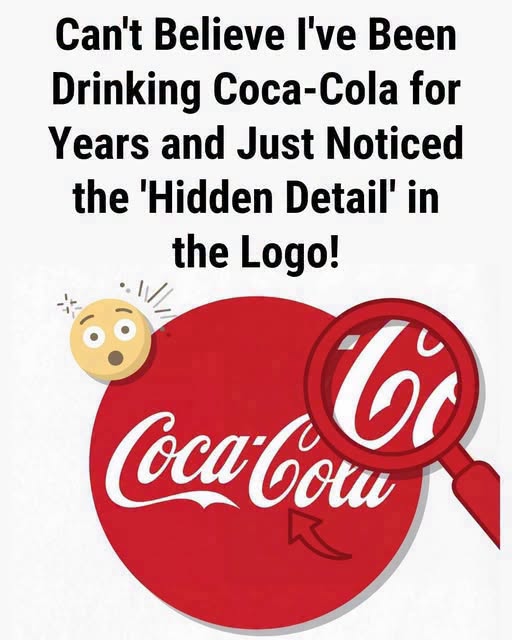
However, social media platforms like TikTok, Instagram, and Reddit have recently exploded with viral discussions pointing out a fascinating, subtle optical surprise hidden right in plain sight. People all over the world are suddenly spotting a clever “hidden detail” tucked inside the famous lettering, and once you finally see it, it is entirely impossible to unsee.
The Anatomy of an Icon: A Century of Design
To understand why this hidden detail is causing such a massive viral sensation, it helps to take a brief step back into history. The Coca-Cola script was not originally designed by a high-tech corporate branding agency with focus groups and psychological data analytics. It was born in 1886 out of pure practicality and penmanship.
Frank Mason Robinson, the bookkeeper and partner of the drink’s inventor Dr. John Pemberton, possessed an exceptional talent for Spencerian script—a popular, highly ornate style of handwriting widely taught in American schools during the late nineteenth century. Robinson believed that the sweeping, elegant letters would look striking on paper and help the fledgling beverage stand out in newspaper advertisements.
Over the decades, the logo underwent minor refinements to enhance its legibility on glass bottles and aluminum cans, but the fundamental cursive style remained intact. It became a masterclass in minimalist visual communication.
Yet, as graphic designers and eagle-eyed consumers have recently pointed out, the iconic script contains a brilliant, unintended optical illusion that bridges typography and international culture in a way the original creators could never have predicted.
The Viral Discovery: What Are People Seeing?
So, what exactly is this hidden detail that has everyone talking?
If you take a high-resolution image of the classic Coca-Cola logo and focus your attention on the space right between the word “Coca” and the word “Cola”, something extraordinary reveals itself. Specifically, look closely at the lowercase letter “C” in the second half of the logo—the “Cola” portion.
Because of the sweeping, upward-curving tail of the first word and the flowing arc of the second, the negative space—the white background framing the red lettering—accidentally forms a distinct, recognizable shape.
Tilt your head slightly or squint at the logo on your phone screen. That specific gap between the two words forms the unmistakable silhouette of a Scandinavian flag (specifically, the Nordic cross featuring a horizontal crossbeam offset toward the hoist side).
When internet sleuths first pointed this out, digital platforms lit up with speculation. Did John Pemberton and Frank Mason Robinson intentionally weave a subtle nod to Scandinavian design into the cursive lettering way back in 1886? Was it a stroke of secret marketing genius buried in plain sight for over a century?
The reality behind the optical illusion is far more grounded, yet equally fascinating.
The Power of Negative Space in Global Branding
Graphic design experts quickly weighed in on the viral trend, explaining that the accidental flag shape is a classic example of pareidolia—the human brain’s innate tendency to find familiar shapes, patterns, and meaningful images in random visual stimuli.
When the Coca-Cola script was originally penned in 1886, global shipping, international branding alignment, and digital vector graphics did not exist. The script was drawn by hand with an ink pen on paper. The spacing between the letters was optimized purely for aesthetic flow and legibility, not to hide secret symbols.
However, the accidental discovery highlights why certain logos achieve legendary status. Great design often relies as heavily on negative space—the empty areas around and between the subject matter—as it does on the primary artwork itself.
Think of other world-famous examples of clever negative space:
-
The hidden white arrow pointing forward between the ‘E’ and the ‘x’ in the FedEx logo, symbolizing speed and precision.
-
The smiling blue arrow curving from ‘A’ to ‘Z’ in the Amazon logo, representing that they sell everything from A to Z.
-
The subtle gorilla and lion hidden within the negative space of the tree trunk in the San Diego Zoo logo.
While Coca-Cola’s hidden flag wasn’t planned in a corporate boardroom decades ago, it operates on the exact same psychological principle. It transforms a static piece of text into an interactive visual puzzle that engages the viewer’s curiosity.
Why Viral Optical Illusions Captivate Us
The massive popularity of the Coca-Cola logo discovery speaks volumes about how we consume culture in the digital age. In a world where news can feel overwhelming and daily routines can become monotonous, our brains genuinely love micro-discoveries.
Finding a hidden detail in a universally familiar object triggers a tiny burst of dopamine. It offers a fleeting moment of cleverness—the satisfaction of saying, “Wait, look at that! Did you know about this?” It turns a boring corporate trademark into a shared, communal secret passed from user to user across millions of screens worldwide.
Furthermore, it reminds us to slow down and pay closer attention to our surroundings. We walk through life surrounded by thousands of logos, brand marks, and visual designs that we tune out on autopilot. When something forces us to pause, look closer, and re-examine the familiar, it shatters our visual numbness.
The Enduring Magic of the Brand
Next time you pull a classic red-and-white can of Coca-Cola from the refrigerator or spot the iconic script painted on the side of a vintage diner, take a second to look past the familiar letters.
Whether you see the accidental Nordic flag, appreciate the intricate beauty of nineteenth-century Spencerian handwriting, or simply enjoy the refreshing taste of the beverage inside, the logo remains a testament to the timeless power of visual communication.
The viral internet phenomenon proves one undeniable truth: even the oldest, most familiar icons in the world still have the capacity to surprise us, provided we are willing to look a little closer at the details hiding right in plain sight.