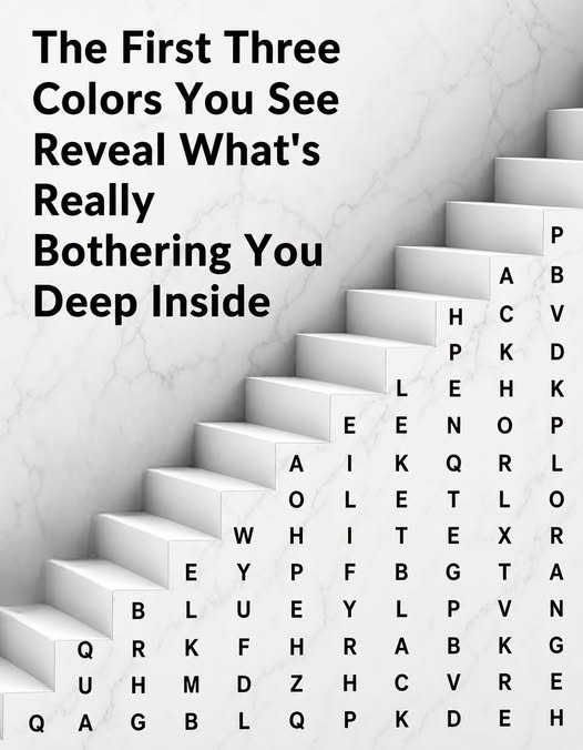
The First Color You Notice May Reflect Your Current Mood—But There’s More to the Story
Have you ever looked at a colorful image and found that one shade immediately jumped out at you before all the others?
Maybe it was red.
Perhaps blue.
Maybe your eyes went straight to yellow, green, purple, or black.
That first reaction can feel surprisingly personal, especially when online quizzes claim the color you notice reveals something hidden about your personality or emotional state.
The truth is more nuanced.
A single color cannot diagnose your mood, predict your personality, or reveal deep psychological truths. Human emotions are far too complex for that. Still, noticing which colors attract your attention can be a fun way to pause, reflect, and think about how you’re feeling in the moment.
That makes color-based exercises useful not as scientific tests, but as simple prompts for self-awareness.
Why Certain Colors Catch Our Attention
Our brains process color extremely quickly.
Before we consciously analyze an image, the visual system is already sorting information based on brightness, contrast, shape, and color.
That means the first shade you notice may be influenced by several things, including:
- Lighting
- Background contrast
- Personal preferences
- Previous experiences
- Current attention
- Cultural associations
So if your eyes immediately land on one color, it does not necessarily mean that color holds a fixed psychological meaning.
But it may still give you something interesting to think about.
Why Color Feels Emotional
Colors often become connected to memories and emotions through repeated experiences.
For example, someone may associate blue with peace because it reminds them of the ocean.
Another person may associate blue with sadness because of cultural expressions or personal memories.
The same color can therefore create completely different reactions in different people.
That is why color interpretation should remain flexible.
If You Notice Red First
Red is one of the most visually powerful colors.
It is often associated with:
- Energy
- Action
- Excitement
- Urgency
- Passion
If red catches your eye first, a playful interpretation might suggest that you are feeling motivated, alert, or ready for action.
But it could also simply mean red had the strongest contrast in the image.
The useful question is not, “What does red prove about me?”
A better question is:
“Do I feel energized or under pressure right now?”
If Blue Stands Out
Blue is commonly connected with calmness, stability, and quiet environments.
Many people find shades of blue relaxing.
If blue immediately attracts your attention, you might use that moment to ask whether you are craving rest, peace, or emotional balance.
Perhaps you have had a busy week and your mind is naturally drawn toward something calming.
Or perhaps blue is simply your favorite color.
Both explanations are perfectly reasonable.
If You Notice Yellow
Yellow is often associated with brightness, warmth, and optimism.
It can remind people of:
- Sunshine
- Summer
- Flowers
- Cheerful spaces
If yellow catches your attention, it might reflect a desire for positivity, creativity, or social energy.
At the same time, very bright yellow can also feel stimulating or intense.
Again, context matters.
If Green Catches Your Eye
Green is frequently linked with nature.
Trees.
Grass.
Gardens.
Forests.
Because of these associations, many people connect green with balance, growth, and renewal.
If green is the first color you notice, you might ask whether you are craving more time outdoors or looking for a sense of stability.
It may also simply reflect a personal preference for natural colors.
If Purple Stands Out
Purple has long been associated with imagination, creativity, and individuality in many cultures.
Some people find it elegant.
Others find it mysterious.
If purple draws your attention, a lighthearted interpretation might suggest that you are in a reflective or creative mood.
But there is no universal meaning.
The feeling purple creates depends heavily on personal experience.
If Black Is the First Color You See
Black often creates strong contrast, so it naturally attracts attention.
People sometimes associate it with sophistication, seriousness, formality, or mystery.
If black stands out first, it does not automatically mean you are sad or negative.
That is an important misconception to avoid.
You might simply be responding to contrast or visual simplicity.
If White Draws Your Attention
White is often connected with openness, cleanliness, and simplicity.
A person drawn to white might feel attracted to order or a fresh start.
Or perhaps the color simply creates the strongest empty space within the image.
Visual perception is influenced by design as much as emotion.
Orange and Social Energy
Orange combines some of the warmth associated with red and yellow.
It is often viewed as cheerful and energetic.
People may associate it with:
- Autumn
- Warmth
- Creativity
- Social gatherings
If orange catches your eye, you might reflect on whether you are seeking more energy or connection.
Pink and Comfort
Pink can carry many different associations depending on shade and culture.
Soft pink may feel gentle or comforting.
Brighter pink may feel lively and expressive.
If pink immediately attracts your attention, you might simply be responding to warmth, familiarity, or brightness.
Brown and Stability
Brown is closely linked with wood, soil, and natural materials.
It can feel grounded and practical.
Someone drawn to brown might enjoy familiar, comfortable environments.
But once again, these are only possible associations rather than psychological conclusions.
Why Online Color Tests Are So Popular
Color quizzes are popular because they are simple.
You don’t need special knowledge.
You look at an image.
Make an instant choice.
Then read an interpretation.
The process is entertaining because people naturally enjoy discovering descriptions that seem personally relevant.
It is similar to reading personality quizzes or visual riddles.
The problem begins only when entertainment is presented as established science.
Mood Is Much More Complicated
Your mood is influenced by countless factors.
These can include:
- Sleep
- Stress
- Relationships
- Work
- Physical health
- Environment
- Recent experiences
No single visual preference can capture all of that.
If you want to understand how you are actually feeling, it is usually more useful to ask direct questions.
Am I tired?
Am I worried?
Do I feel calm?
Have I been overwhelmed?
Do I need rest?
Those questions provide far more meaningful information than any color alone.
Use Color as a Mindfulness Prompt
One healthy way to use these visual exercises is as a short mindfulness activity.
Look at the image.
Notice the first color that attracts you.
Then pause.
Instead of immediately searching for a personality label, ask yourself why you might have noticed it.
Does it remind you of something?
Does the color feel calming?
Exciting?
Comforting?
Neutral?
That reflection can turn a simple online puzzle into a useful moment of awareness.
Colors Can Change With Context
You may notice different colors on different days.
That does not mean your personality has completely changed.
It may simply reflect changes in:
- Lighting
- Screen brightness
- Visual contrast
- Attention
- Personal mood
This flexibility is another reason not to interpret the result too seriously.
Personal Associations Matter Most
Imagine two people looking at green.
One person remembers peaceful summers spent in the countryside.
Another remembers a stressful workplace where the walls were painted green.
They are unlikely to have the same emotional reaction.
Personal history shapes how colors feel.
That is one reason universal color meanings are difficult to establish.
Cultural Differences Matter Too
Colors can carry very different meanings across cultures.
A color associated with celebration in one place may be associated with seriousness in another.
This further demonstrates why color psychology should not be reduced to rigid rules.
Context matters.
Culture matters.
Individual experience matters.
Can Color Affect Environment and Mood?
Color can influence how spaces feel.
Bright colors may make some rooms feel energetic.
Muted colors may feel relaxing.
But people’s responses vary widely.
When decorating a bedroom, office, or living area, personal comfort is often more important than following strict color rules.
A Better Way to Interpret the Test
Instead of thinking:
“I noticed red, therefore I am an aggressive person.”
Try thinking:
“I noticed red first. What does red make me feel right now?”
That shift turns the exercise from judgment into reflection.
It is far more useful and far less misleading.
Final Thoughts
The first color you notice in a picture can be a fun starting point for thinking about your current mood.
Maybe blue reminds you that you need some calm.
Perhaps yellow makes you think about optimism.
Green might make you crave time outdoors.
Red may feel energizing.
But no shade can define who you are.
Color-based personality tests are best treated as entertainment or mindfulness prompts rather than scientific assessments.
Your emotional life is shaped by experiences, relationships, habits, memories, and circumstances that are far richer than any single visual choice.
So the next time a colorful image asks, “Which color did you see first?” enjoy the question.
Notice your reaction.
Think about what the color means to you personally.
Then remember that the most meaningful insight doesn’t come from the color itself.
It comes from taking a moment to pause and check in with yourself.